Have you ever tried to schedule a meeting with one or more people, only to play "dueling calendars"?
Even one-on-one lunches can be tough without shared calendars. Getting groups together is considerably more challenging.
Most people understand the hassles of playing telephone tag, and email can be the same. To organize a meeting or event, it might seem that it's easy to simply send an email message. But more often than not, you need to know when people are available. For example, if you're inviting six people, you need to wait for six separate responses, manually collate them, and hope you've got a match, then confirm with all the details. If you don't get a match, you have to start all over again. Moreover, there's just too much room for confusion and error in this process.
Well, I just found a few tools that help solve these problems.
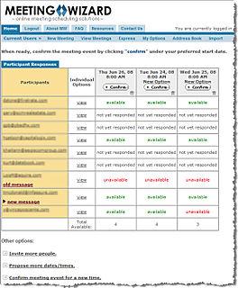
MeetingWizard sends the invitations and collates all information and all responses in one place. Another advantage is that it organizes and standardizes the event information so that important details aren't missed, and users become familiar with a standard request-response interface. This makes scheduling go much more smoothly.
Another tool I found is called "Presdo" and excels at understanding natural language phrases,like: next Wednesday or two weeks from today.

I also liked Presdo's user interface, which includes the ability to search for locations and include map links in the invitation. Here is an example.

Two others worth checking-out include Tungle and TimeBridge.
So, let me know what you think.