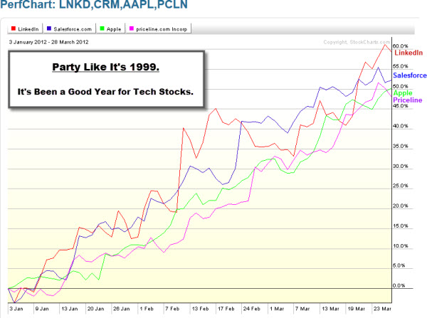
Markets posted the biggest weekly drop of 2012, as investors weighed steady domestic-labor and jobs market data amid a backdrop of on-going concerns about Europe's economy.
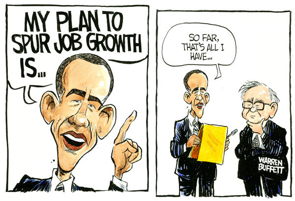
Short term, traders may be asking whether the stock market can sustain its gains, or are investors facing a pullback? But, longer-term, there are bigger issues deserving focus and attention.
Here is a video from a source many may find unlikely to intelligently deconstruct the National Debt and Federal Budget.
Nonetheless, watch as Tony Robbins discusses the $15 trillion U.S. national debt and what can we do about the enormous growing federal budget deficit?
It is worth a few few minutes … he is very good at simplifying things and telling stories.
Markets posted the biggest weekly drop of 2012, as investors weighed steady domestic-labor and jobs market data amid a backdrop of on-going concerns about Europe's economy.
Short term, traders may be asking whether the stock market can sustain its gains, or are investors facing a pullback? But, longer-term, there are bigger issues deserving focus and attention.
Here is a video from a source many may find unlikely to intelligently deconstruct the National Debt and Federal Budget.
Nonetheless, watch as Tony Robbins discusses the $15 trillion U.S. national debt and what can we do about the enormous growing federal budget deficit?
It is worth a few few minutes … he is very good at simplifying things and telling stories.
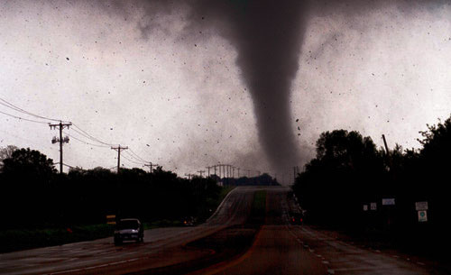
Also, here is a video of tractors being tossed around like rag dolls by the Tornado.
A lot of that happened right by here. However, we were lucky and suffered relatively little damage.
Today, things are getting back to normal.
You'll be happy to hear that the capitalistic eco-system is at work again. Hordes of salespeople are going door-to-door offering to fix a roof, clean the yard, repair your fence, or suck out the dents left on your car.
Considering the alternative, I'll take that as a good sign – and be grateful for surviving the 2012 Attack of the Killer Tornadoes.
I spent part of this week at the First Rate Performance Conference. It was held at the Four Seasons resort in Las Colinas, Texas (which is a pretty nice place for a retreat).
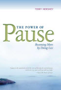
In addition to hearing industry experts and company representatives talking about equations, risk management, and regulatory compliance, the conference featured Terry Hershey, who wrote a book called The Power of Pause (Becoming More by Doing Less).
In the book, Terry counters the modern cultural decree of More-Bigger-Faster. His message was simple (and perhaps even easy).
One of the takeaways was that some things are tactical, some things are strategic, and some things are transformational. All of these things can be good … but the quality of your life and the results results you get change as you spend less time with the tactical and move towards the transformational.
Each student came up with a list and shared with the class. As you might guess, students called out entries like the Pyramids, the Amazon River, the Grand Canyon, or the Taj Mahal. The teacher cheered them on and told them what a great job they were doing.
But one girl stayed silent. The teacher asked her about her list, and the girl answered, "I don't think I understand the assignment."
"Why?"
"I don't have any of the right answers."
"Well, why don't you tell us which you wrote on your paper, and we'll help you."
"Okay," said the girl, "I think the seven wonders of the world are … to see, to hear, to touch, to smell, to feel, to love, and to belong."
Somewhere along the way, we tend to forget what we used to know.
How much of our daily experience is defined by what we shoot for and what we measure?
Life can be so "daily". That's a problem, isn't it? No wonder we're easily tempted by things that are urgent, rather than important. But it doesn't have to be that way … and the first step is recognizing that it doesn't have to be that way. The second step is figuring out how you want it to be instead.
To see some of his messages in video format, click this link.
I spent part of this week at the First Rate Performance Conference. It was held at the Four Seasons resort in Las Colinas, Texas (which is a pretty nice place for a retreat).
In addition to hearing industry experts and company representatives talking about equations, risk management, and regulatory compliance, the conference featured Terry Hershey, who wrote a book called The Power of Pause (Becoming More by Doing Less).
In the book, Terry counters the modern cultural decree of More-Bigger-Faster. His message was simple (and perhaps even easy).
One of the takeaways was that some things are tactical, some things are strategic, and some things are transformational. All of these things can be good … but the quality of your life and the results results you get change as you spend less time with the tactical and move towards the transformational.
Each student came up with a list and shared with the class. As you might guess, students called out entries like the Pyramids, the Amazon River, the Grand Canyon, or the Taj Mahal. The teacher cheered them on and told them what a great job they were doing.
But one girl stayed silent. The teacher asked her about her list, and the girl answered, "I don't think I understand the assignment."
"Why?"
"I don't have any of the right answers."
"Well, why don't you tell us which you wrote on your paper, and we'll help you."
"Okay," said the girl, "I think the seven wonders of the world are … to see, to hear, to touch, to smell, to feel, to love, and to belong."
Somewhere along the way, we tend to forget what we used to know.
How much of our daily experience is defined by what we shoot for and what we measure?
Life can be so "daily". That's a problem, isn't it? No wonder we're easily tempted by things that are urgent, rather than important. But it doesn't have to be that way … and the first step is recognizing that it doesn't have to be that way. The second step is figuring out how you want it to be instead.
To see some of his messages in video format, click this link.