
Every once in a while, you come across a graphic that makes you stop scrolling.
This one from Visual Capitalist does that for me.
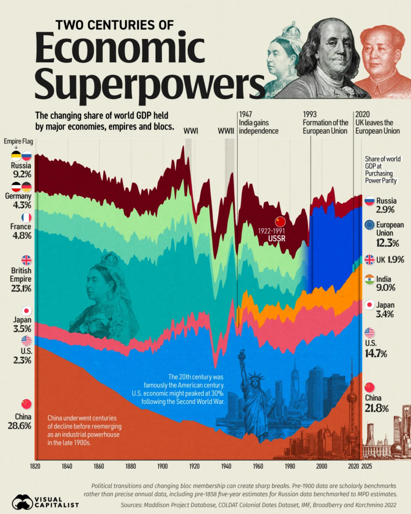
It shows how the distribution of global economic power has changed over the past roughly 200 years. And while 200 years sounds like an incredibly long time, the graphic makes the shifts feel surprisingly fast.
via visualcapitalist
The first thing that jumps out is how different the world looks at different points along the timeline.
In the early 1800s, China and India accounted for enormous shares of global economic output. Then the Industrial Revolution changed the picture. Britain rose. Europe expanded its share. The United States began its climb.
And then, particularly in the decades following World War II, the U.S. became an extraordinary economic outlier.
That dominance didn’t last forever, either.
Japan emerged as an economic powerhouse in the second half of the 20th century. Europe consolidated some of its economic weight through the European Union. And, over the last few decades, China has experienced one of the most dramatic increases in its share of the economy.
Look at the whole thing at once, and there’s something uncomfortable in it: There is no permanent winner.
That’s easy to nod along with in the abstract. It’s harder if your portfolio, your career, and most of your working assumptions were formed during the one stretch of that chart where the U.S. was an outlier.
The chart also comes with an important caveat regarding measurement. It uses purchasing power parity (PPP)- adjusted GDP, which is useful for comparing the real size of economies because it accounts for differences in price levels between countries. It isn’t the same as comparing market-value GDP, financial market capitalization, military power, or global influence. In other words, “economic power” is a useful shorthand here, not a single definitive measure.
But that doesn’t make the chart less interesting. If anything, it makes it more interesting.
Because we’re looking at how the economic center of gravity moves.
It’s easy to look at a chart like this and focus on China. The rise is remarkable, and the time frame is remarkably short.
But the level is the least useful thing on the chart. The useful question is what produced it — and whether those conditions still hold.
It is also interesting to look for cycles and patterns within the larger ones (which is a fundamental part of algorithmic trading and fund management).
Winning Is a State of Doing.
The United States didn’t simply become the dominant economic power because it was destined to be so. Neither did Britain or Japan.
Each one benefited from a particular combination of circumstances: technology, resources, demographics, institutions, geography, capital, trade, infrastructure, education, political decisions, and, sometimes, simply being in the right place at the right time.
Britain had the Industrial Revolution.
The United States had an enormous domestic market, abundant resources, expanding infrastructure, and technological innovation (which eventually enabled it to become an industrial and financial hub for the world).
Japan’s postwar transformation turned it into a manufacturing and technology powerhouse.
China’s rise has been built on an enormous labor force, industrialization, infrastructure investment, globalization, and decades of rapid productivity growth.
The point isn’t that any one of these explanations is the explanation.
It’s that economic leadership usually results from a system of reinforcing advantages.
And systems can change.
We tend to talk about countries, companies, and even industries as though their current position is an intrinsic characteristic.
The chart is a good reminder that today’s structure is just a snapshot.
The Snapshot is not the whole picture.
An industry is growing, so we assume it will continue growing.
An investment strategy has worked for the past decade, so we assume it will continue to do so.
A country has dominated economically for generations, so we assume that dominance is simply part of the natural order.
But those are all observations about a state.
What really matters is the process that produced the state.
That’s one of the reasons long-term charts can be so useful. They force us to stop looking at where something is and start asking how it got there.
How Is The Game Changing?
What conditions are being created today that might look obvious in hindsight 30 years from now?
I’ll offer one. Every riser on that chart — Britain, the United States, Japan, China — converted the same basic inputs into output: labor, capital, and infrastructure, organized well enough and early enough to compound. The mix changed. The mechanism didn’t.
That’s the assumption I’d watch out for. If AI genuinely decouples output from headcount, the engine that drew the last two hundred years of that chart stops being the engine. Population becomes less of an advantage. Installed compute, energy, and capital discipline become more of one.
I don’t know if this will prove to be right … But it’s the kind of condition that’s invisible while it’s forming and obvious afterward — which is what every earlier transition on that chart looked like at the time.
One data point in that direction: China’s share rose during a demographic dividend that has since reversed. The most recent line on the chart was drawn partly by a tailwind that is now a headwind.
The world feels more permanent than it is. Every generation on that chart believed the arrangement they were born into was the natural order. Every one of them was looking at a snapshot.
The uncomfortable part isn’t that positions change. It’s that they change slowly enough to ignore and fast enough to matter.
So the question worth carrying isn’t who’s winning. It’s what you’re compounding — and whether the conditions that made it work are still the conditions you’re in.
And when you get complacent, a lot can change!
Hope that helps.
Leave a Reply