Thought this was worth sharing.
Click the image to launch.
Happy Holidays.
The unemployment rate dropped to 7.0% (from 7.3%) while the U.S. economy added 203,000 jobs in November. In addition, the labor force participation rate rose to 63.0% (from 62.8%). These numbers were stronger than expected.
Nonetheless, the U.S. labor market remains below its pre-recession employment numbers.
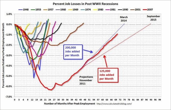
Calculated Risk posts a monthly chart that puts the current jobs recovery into perspective. It is often referred to as the "Scariest Chart Ever". It shows the job losses from the start of the employment recession, in percentage terms, compared to previous post WWII recessions.
via CalculatedRisk.
This chart shows the depth of the recent employment recession — worse than any other post-war recession — and the relatively slow recovery due to the lingering effects of the housing bust and financial crisis.
If things continue as they have been, it appears payrolls will exceed the pre-recession peak in mid-2014.
Currently, there are about 1.3 million fewer payroll jobs than before the recession started; and at the recent pace of job growth it will take about 7 months to reach the previous peak.
Given the circumstances, I think the chart shows we've made good progress. Talk about Qualitative Easing, coordinated actions by global Central Banks … or a pretty visible 'unseen hand' all you want … but the Economy and Market seem to have adapted well to change.
You can learn a lot by watching puppies. Barley, here, is sporting the "Cone of Shame" … which was our attempt to stop him from licking his nether-region till it was swollen and raw.

Despite our best efforts, Barley has figured-out how to contort his body and use his prehensile tongue to get the job done anyway.
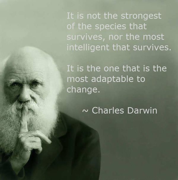
I guess Charles Darwin was right … "It is not the strongest of the species that survives, nor the most intelligent that survives. It is the one that is the most adaptable to change."
Most find a way to get what they must have.
Here are some of the posts that caught my eye. Hope you find something interesting.
What happens doesn't matter nearly as much as what you what make it mean … and what you choose to do.
Dallas got about an inch of ice and snow towards the end of last week, and we are still at a virtual stand-still five days later.
Growing up in New England, this would have been so minor that people wouldn't have called it a 'storm'. Because ice is so rare here, and we don’t have sanding, salting, or scraping capabilities (or people skilled enough to be comfortable driving in it) this was a Storm.
As a result, the best plans gave way to the shut-down.
Snow isn't 'good' or 'bad' … and neither was the change of plans.
Fund managers recognize the importance of sensibly diversifying risks and opportunities.
Be that as it may, as MotherJones reported in the wake of the financial crisis, the nation's 10 largest financial institutions held 54% of our total financial assets (compare that to the 20% they held in 1990). Meanwhile, the number of banks has dropped from more than 12,500 to about 8,000.
Here is a map, from the Federal Reserve, that shows the consolidation. Click to see a bigger version.
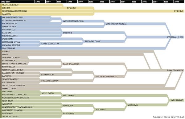
The infographic, above, shows how 37 banks have merged to become just four — JPMorgan Chase, Bank of America, Wells Fargo and CitiGroup (in a period of barely two decades).
Many people are shocked by a chart like this. It must be 'bad' to have so much controlled by so few, right?
But it isn't hard to find a version of this story playing-out in other industries: Print Media, Music, Broadcast Channels, Consumer Products … this type of consolidation happens for a reason.
A firm that marshals that more resources gains competitive advantage and has more ways to win.
They benefit from economies of scale, transactional leverage, better distribution and partners, and more ways to diversify risks. In addition, if they work to communicate, collaborate, and coordinate their actions (and data) they can unlock opportunities that others simply don't have (or can't see).
Here is a Chart Showing Some of the 'Winners' at that Game.
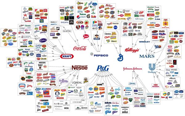
The following chart highlights our "Illusion of Choice". A surprisingly big portion of what you buy comes from one of these 10 mega-companies (Kraft, Coca-Cola, PepsiCo, Kellog's, Nestlé, Proctor & Gamble, , Mars, Johnson & Johnson, General Mills, and Unilever).
It's amazing to see what these giants own or influence. Click the picture to see a bigger version.
via Reddit.
Here is a more specific example. You probably think you are familiar with Nestlé. It is famous for chocolate; but did you realize it was $200 billion-corporation … and the biggest food company in the world? Nestlé owns nearly 8,000 different brands worldwide, and takes a stake in (or is partnered with) many others. Included in this network is shampoo company L'Oreal, baby food giant Gerber, clothing brand Diesel, and pet food makers Purina and Friskies.
Kind of cool?
Here are some of the posts that caught my eye. Hope you find something interesting.
In Glengarry Glen Ross, Alec Baldwin played a venom-spewing sales manager. His performance burned "Always Be Closing" and "Coffee is for Closers" into a generation's collective unconscious.
In the spirit of the holidays, Saturday Night Live created the spoof Glengarry Christmas – Elf Motivation ("Always Be Cobbling!"). Here it is.
Here is the original scene.
Bet that puts you in a festive mood.
Hope you had a Happy Thanksgiving.
I visited family.
One of the things that caught my attention was how attached to stories we are … our own, and the stories of others.
They help us decide who is naughty or nice. They help us decide who to spend more time with … and where we fit in.
Stories are emotion catalysts and amplifiers. Choose the 'right' ones, and you feel good. Focus on the 'wrong' one and you feel bad.
Well-told stories make us care. Humans use 'story' to make sense of things. If you create the narrative, the process is intentional. However, for most, the quality of our stories is not a conscious process.
How Do You Craft a Great Story?
A good story can make the gathering feel that much closer. A good story can flip a conversation at a party from completely awkward to wonderful.
A good story can glue your nose to a book. And, on screen, a good story can rivet generation after generation.
Story-telling is an important skill. So, how do you tell a good story?
Andrew Stanton, the Pixar writer and director behind both Toy Story and WALL-E, has many ideas, and he shared his expertise in his TED Talk, The clues to a great story .
Storytelling is like joke telling. It's knowing your punchline, your ending, knowing that everything you're saying, from the first sentence to the last, is leading to a singular goal, and ideally confirming some truth that deepens our understandings of who we are as human beings.
We all love stories. We're born for them. Stories affirm who we are. We all want affirmations that our lives have meaning. And nothing does a greater affirmation than when we connect through stories. It can cross the barriers of time, past, present and future, and allow us to experience the similarities between ourselves and through others, real and imagined.
Here is an infographic that sets out the basic steps to a great story.
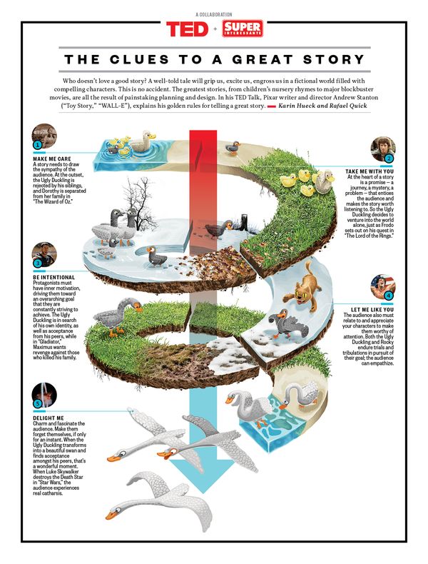
Stories are not just for kids.
Make me care. Take me with you. Be intentional. Let me like you. Delight me.
Words to live by!
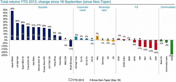
The Federal Open Market Committee's surprise decision to refrain from announcing a tapering down of its quantitative easing program on September 18 has given a lift to a variety of markets around the world.
The chart below highlights returns across asset classes — both in the year to date and since the September 18 decision.
via: Business Insider
The orderly returns by asset class surprised me (Equities, Credit, Debt, FX, then Commodities). It also surprised me that the biggest winners since the Fed decision were Spanish and Italian equities.
What about you?
Holiday travel made better for the NSA now that the FAA allows travelers to use electronics during takeoff and landing.
Here are some of the posts that caught my eye. Hope you find something interesting.
The Stock Market tends to be 'mean reverting' … meaning when the pendulum swings too far in one direction, it makes sense to expect it to swing back in the other direction.
Recently, the equity market rally has surprised people with its size and duration. Seemingly everywhere I go, there are traders talking about how they expect a 'Top' but "don't want to fight the Fed."
Yes, price is up and so is the trend …but how unusual is this year's big move up?
The answer is that it's been 'pretty typical'.
OK, big one-year returns can be 'normal,' but this has gone on for three years … how unusual was that move?
The chart below shows that the returns for the past three years were not unusual, and fits nicely in the fat part of a somewhat normal distribution.
While it's reasonable to argue that stocks are getting expensive, it may be premature to bet that stocks are doomed to crash.
Observation and cautious action often pay better, over the long-term, than fear or greed.