admin

  • Ted Cruz Ends Awkwardly – Accidentally Punches Wife in the Face [video]

    Ted Cruz accidentally hit his wife in the face with his fist and elbow seconds after dropping out of the presidential race.  As you might have guessed, images of the awkward husband-wife moment spread like wildfire on social media.


    via Vine.

    For many, that image brought to mind another awkward Cruz moment: fumbling with Carly Fiorina's hand as he announced her as his running mate. That's worth seeing again.


    via Vine.

    For more, here is a CNN video and a funny "I Will Remember You" video.

    Bet things stay awkward as Trump v Clinton takes the main stage.


  • Markets at the “Sell in May and Go Away” Point of the Year

    There has been a pull-back off recent highs.  Is it a buying opportunity or a danger sign?

    Research published by Yale Hirsch in the Stock Trader’s Almanac argues that the market year is broken into two six-month seasonality periods.  The period from May 1 through October 31 is seasonally unfavorable, and the market most often finishes lower than it was at the beginning of the period. Conversely, the period from November 1 through April 30 is seasonally favorable, and the market most often finishes the period higher.

    While the statistical average results for these two periods are quite compelling, trying to ride the market in real-time in hopes of capturing these results is not always as easy as it sounds.

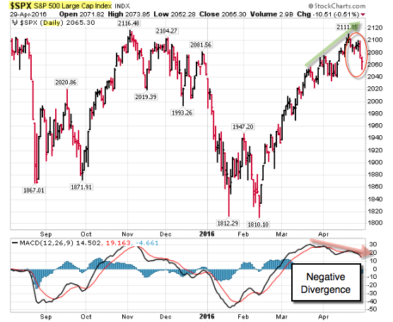
     Here is a chart of the S&P 500 Index showing the recent thrust higher and recent correction.  In addition, notice the negative divergence (where recent price highs happened with lower momentum).  This is often taken as an early topping indicator (or sign of underlying weakness).


    160501 SP500 Daily Negative Divergence

    via Stockcharts.com.


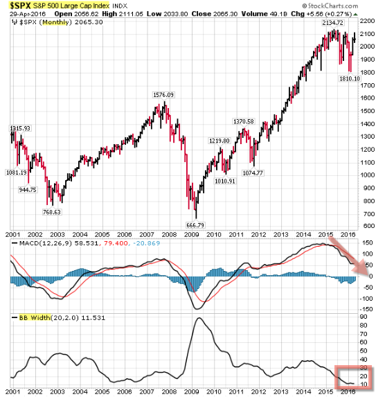
    Meanwhile, the monthly chart shows weakness too (with negative divergences and a classic volatility squeeze).


    160501 SP500 Monthly Squeeze

    via Stockcharts.com.


    Traders expect a big move after periods of compressed range (like the one we are in now).  One of the indicators I keep an eye on is the band-width of Bollinger Bands (which is a measure of volatility). When it gets narrow for an extended period, that "squeeze" puts me on alert for expanding volatility.

    What do you do?  You watch price.  Yes, we are near highs in an up-trend.  On the other hand, there's everything else.

    Put that with the "Sell in May and Go Away" theory … and what you have is a caution light.

  • Here Are Some Links for Your Weekend Reading

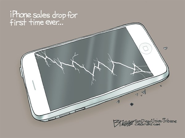
    Signs of the Apocalypse: iPhone sales drop for the first time ever … and one of the Koch brothers admits Hillary might be a better than Republican candidates.


    160501 Cartoon iPhone Sales Drop

    And …


    160501 Cartoon Sign of the Apocolypse


    Here are some of the posts that caught my eye. Hope you find something interesting.


    Lighter Links:


    Trading Links:

  • A Sophisticated Trump

    What if Donald Trump had elocution lessons?

    Here is a video where his voice was dubbed to sound British.  Nonetheless, all words are verbatim.

    Interesting and funny.


     via YouTube.

  • A Sophisticated Trump

    What if Donald Trump had elocution lessons?

    Here is a video where his voice was dubbed to sound British.  Nonetheless, all words are verbatim.

    Interesting and funny.


     via YouTube.

  • World Markets Update

    Here is a summary of world market performance from Doug Short at Advisor Perspectives.

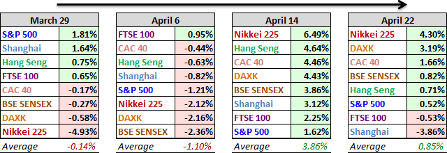
    The global rally in equities continued last week, but at a subdued pace.  A benchmark 'gang of eight' group of global indices posted an average gain of 0.85% (well off the 3.86% average of the previous week). Moreover, that average included a 4.30% surge in Japan's Nikkei (which follows its 6.49% thrust the previous week).

    A Closer Look at the Last Four Weeks

    The tables below provide a concise overview of performance comparisons over the past four weeks for these eight major indexes.  The average for each week also is included to evaluate the performance of a specific index relative to the overall mean and better understand weekly volatility.


    160424 world-indexes-4-week-compsite


    A Closer Look at the Year-to-Date Performance


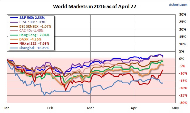
    Here is an overlay of the eight illustrating their comparative performance so far in 2016.
     

    160424 world-indices-in-2016


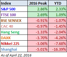
    160424 World Indices YTD-tableHere is a table of the 2016 performance, sorted from high to low, along with the interim highs for the eight indexes.

    The top performing S&P 500 and the UK's FTSE 100 are the only two indexes with year-to-date gains, unchanged from last week.

    China's Shanghai Composite earned the dubious distinction of biggest loser last week, supplanting the soaring Nikkei in the basement. After this week's loss, it has fallen deeper into the YTD red.

     
    All the indexes are calculated in their local currencies.